
Color theory is the study of how colors interact and influence each other. It blends art and science, exploring fundamentals like the color wheel, primary and secondary colors, and harmony.
Definition and Importance of Color Theory
Color theory is the study of how colors interact and influence each other, blending art and science to understand color properties. It explores fundamental concepts like the color wheel, primary and secondary colors, and harmony principles. This theory is crucial for artists, designers, and educators, as it provides a framework for creating balanced compositions and evoking emotional responses. By understanding color relationships, professionals can effectively use color to communicate ideas, enhance visual experiences, and guide creative decisions. Its principles are applied in art, design, and technology, making it a cornerstone of visual communication and aesthetic expression.
Overview of Color Theory Basics
Color theory begins with the color wheel, which organizes colors systematically. It starts with primary colors—red, yellow, and blue—which cannot be created by mixing others. Secondary colors, such as green, orange, and purple, are formed by mixing two primaries. Tertiary colors, like yellow-green or blue-violet, result from combining primary and secondary colors. Color mixing follows either additive (light-based) or subtractive (pigment-based) models. Key concepts include hue (color name), value (lightness/darkness), and saturation (color intensity). Understanding these basics enables effective use of color harmony, contrast, and schemes in art, design, and digital media, enhancing visual communication and creativity.
Evolution of Color Theory Over Time
Color theory has evolved significantly, beginning with Newton’s groundbreaking work on light and the color wheel in the 17th century. Chevreul later introduced the theory of color opposites, influencing art and design. In the 20th century, Johannes Itten and the Bauhaus movement expanded these concepts, emphasizing color harmony and emotional impact. Modern advancements in digital technology have further refined color theory, introducing models like RGB and CMYK. Today, color theory is a dynamic field, blending psychology, physiology, and technology to enhance visual communication and design across various mediums, from art to digital screens.
History of Color Theory
The history of color theory began with Newton’s color wheel, followed by Chevreul’s theory of opposites. Johannes Itten later expanded these concepts, shaping modern color theory and its applications in art and design.
Newton’s Color Wheel and Its Significance
Sir Isaac Newton’s color wheel, developed in 1666, revolutionized color theory by arranging colors in a circular format. It demonstrated that white light contains all visible colors, which can be refracted into red, orange, yellow, green, blue, indigo, and violet. Newton’s model showed how primary colors (red, yellow, blue) mix to form secondary colors (orange, green, violet). His work laid the foundation for understanding color relationships, inspiring later theorists like Chevreul. The color wheel remains a fundamental tool for artists and designers, illustrating harmony, contrast, and the blending of hues. Its significance lies in its ability to visually organize colors and their interactions.
Chevreul’s Theory of Color Opposites
Michel Eugène Chevreul’s “Theory of Color Opposites” emerged from his work with dye production, noting that contrasting colors intensify each other. He identified that placing two colors side by side creates a vibrant effect, as each color appears more intense due to the visual contrast. Chevreul’s findings, published in The Principles of Harmony and Contrast of Colors, introduced the concept of simultaneous contrast, where colors influence each other’s perception. His work significantly impacted art, design, and fashion, providing practical applications for enhancing visual appeal through strategic color pairing.
Contributions of Johannes Itten to Modern Color Theory
Johannes Itten, a Bauhaus artist and educator, revolutionized color theory by emphasizing its practical applications in art and design. He developed the color sphere, a three-dimensional model of color relationships, and introduced the concept of color contrasts, categorizing them into seven types. Itten’s teachings focused on the emotional and expressive qualities of color, encouraging artists to explore subjective experiences. His work laid the foundation for modern color education, influencing designers and artists worldwide. Itten’s legacy continues through his writings and the enduring popularity of his color theory courses.
Basic Color Theory Concepts
Basic color theory explores primary, secondary, and tertiary colors, the color wheel, and key elements like hue, value, and saturation, forming the foundation of color understanding.
Primary, Secondary, and Tertiary Colors
Primary colors—red, yellow, and blue—are the fundamental hues that cannot be created by mixing others. Secondary colors, such as green, orange, and violet, are formed by mixing two primaries. Tertiary colors, like yellow-green and blue-violet, result from combining a primary with a secondary. These categorizations are essential for understanding color mixing and the structure of the color wheel, which organizes colors systematically. This hierarchy aids artists and designers in creating harmonious color schemes and understanding pigment interactions. Mastering these basics is crucial for effective color application in various artistic and design contexts.
Understanding the Color Wheel
The color wheel is a circular diagram that organizes colors based on their wavelengths and relationships. It begins with primary colors—red, yellow, and blue—and progresses through secondary colors like green, orange, and violet. Tertiary colors, created by mixing primary and secondary hues, further expand the spectrum. The wheel illustrates how colors relate harmoniously, with complementary colors opposite each other and analogous colors adjacent. This tool, rooted in Newton’s theories and expanded by modern colorists like Johannes Itten, helps artists and designers create balanced and visually appealing color schemes. It also reveals how warm and cool colors evoke different emotional responses, enhancing creativity and design precision.
Hue, Value, and Saturation Explained
Hue refers to the actual color itself, such as red, blue, or yellow, and is the basic color name. Value indicates the lightness or darkness of a color, ranging from black to white. Saturation describes the intensity or purity of a color, with higher saturation meaning a more vivid color. Together, these three components form the foundation of color theory, enabling the creation of diverse color combinations. Understanding hue, value, and saturation is essential for designing harmonious and visually impactful color schemes in art, design, and digital media. They guide how colors interact and evoke emotions, making them indispensable tools for creatives.

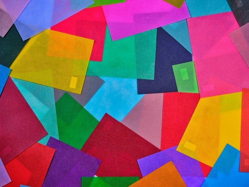
Color Harmony and Contrast
Color harmony refers to the way colors work together, while contrast highlights their differences. Principles like complementary, analogous, and triadic schemes create visually striking effects.

Principles of Color Harmony
Color harmony involves organizing colors to create visually appealing effects. Key principles include complementary, analogous, and triadic schemes. Complementary colors, like blue and orange, enhance contrast, while analogous colors, such as blue, green, and yellow, create smooth transitions. Triadic schemes use three evenly spaced colors on the wheel for vibrant effects. The 60-30-10 rule suggests balancing dominant, secondary, and accent colors. Harmony also considers warmth, coolness, and saturation. Proper balance ensures compositions feel cohesive, guiding the viewer’s eye and evoking emotions. These principles are foundational for artists, designers, and anyone aiming to create impactful visual experiences.
Complementary, Analogous, and Triadic Color Schemes
Complementary schemes pair colors opposite on the wheel, like blue and orange, creating high contrast. Analogous schemes use adjacent colors, such as blue, green, and yellow, for smooth transitions. Triadic schemes involve three colors spaced evenly, like red, yellow, and blue, offering vibrant harmony. These schemes enhance visual impact and emotional resonance. Complementary colors highlight focal points, analogous create cohesion, and triadic add dynamism. They guide the viewer’s eye and evoke specific moods, making them essential tools for artists and designers seeking to convey meaning through color.
The Role of Contrast in Color Design
Contrast in color design enhances readability and visual appeal by creating distinct differences between elements. High contrast, like black and white, draws attention, while low contrast offers subtlety. Color contrast affects perception, guiding the viewer’s focus and emotional response. It helps establish hierarchy and balance in compositions. Proper use of contrast ensures accessibility, making designs inclusive for varying visual abilities. Understanding contrast ratios and their effects on aesthetics is crucial for effective color design. This principle is fundamental in both traditional and digital media, ensuring clear communication and engaging visual experiences across diverse applications.
Color Models and Systems
Color models are systems for organizing colors, such as additive (RGB) for screens and subtractive (CMYK) for print, alongside Munsell’s color space approach.
Additive vs. Subtractive Color Models
Additive color models, like RGB, combine red, green, and blue light to produce a wide spectrum of colors, resulting in white when all three are combined. These models are used in digital displays. Subtractive models, such as CMYK, use cyan, magenta, yellow, and black inks to absorb certain wavelengths, producing darker tones. When combined, they create black. Additive systems are based on light emission, while subtractive rely on pigment reflection. Understanding these principles is crucial for designing visuals that translate effectively across screens and printed materials, ensuring consistent color representation. Each model serves distinct purposes in digital and physical media.
RGB, CMYK, and Munsell Color Systems
RGB (Red, Green, Blue) is an additive color system used in digital displays, combining light to create vibrant colors. CMYK (Cyan, Magenta, Yellow, Black) is a subtractive system for printing, mixing inks to produce diverse hues. The Munsell Color System, developed by Albert Munsell, organizes colors based on hue, value, and chroma, offering a precise method for color identification and matching. Each system serves distinct purposes: RGB for screens, CMYK for print, and Munsell for detailed color analysis. Understanding these systems is essential for effective color reproduction across various mediums, ensuring consistency and accuracy in design and art.
Understanding Color Spaces
Color spaces define the range of colors that can be displayed or printed, varying across devices and mediums. Common spaces include sRGB for digital screens, Adobe RGB for professional photography, and ProPhoto RGB for high-end printing. Device-dependent spaces like CMYK are tailored for physical outputs, while LAB color space offers a device-independent standard. Understanding color spaces is crucial for maintaining color accuracy and consistency, ensuring designs and artworks appear as intended across different platforms and devices. Proper use of color spaces enhances visual communication and preserves artistic intent in both digital and physical formats.
Applications of Color Theory
Color theory is applied in various fields beyond art, including data visualization, scientific research, and digital media, aiding in effective communication and accurate data representation.
Color Theory in Art and Design
Color theory is foundational in art and design, guiding the creation of visually appealing compositions. It helps artists and designers understand how colors interact, enabling the use of complementary, analogous, and triadic schemes to evoke emotions and convey meaning. The color wheel is a central tool, illustrating relationships between hues. Techniques like contrast and harmony are used to balance designs, while concepts like warm and cool colors influence the mood of a piece. By applying these principles, creators can craft works that engage and inspire, making color theory indispensable in both artistic expression and professional design practices.
Color Psychology and Emotional Impact
Color psychology explores how hues influence emotions and perceptions, shaping experiences in art and design. Warm colors like red and orange evoke energy and passion, while cool tones such as blue and green create calmness. Cultural differences play a significant role, as colors like white symbolize purity in Western cultures but mourning in others. Understanding these emotional impacts allows designers to strategically use colors to convey messages and elicit desired responses, ensuring alignment with the intended mood and audience. This emotional connection makes color psychology a powerful tool in creative and communicative processes.
Color Theory in Digital Media and Technology
Color theory plays a pivotal role in digital media and technology, influencing design and user experiences. The RGB (Red, Green, Blue) color model is central to digital displays, enabling vibrant visuals. Understanding color harmony and contrast enhances UI/UX design, ensuring readability and engagement. CMYK (Cyan, Magenta, Yellow, Key/Black) is crucial for printing, maintaining color accuracy. Digital tools leverage color theory for realistic simulations, while artists use it for creative expression. Advances in technology, like HDR and wide color gamuts, expand possibilities, making color theory essential for innovation in digital spaces and visual communication.

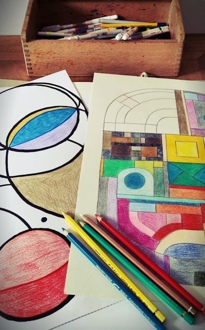
Tools and Resources for Learning Color Theory
Explore comprehensive PDF guides, printable color wheels, and interactive tools. These resources offer practical lessons on color mixing, harmony, and design principles for both beginners and professionals.
Printable Blank Color Wheel Templates
Printable blank color wheel templates are essential tools for artists and designers. These templates provide a visual representation of color relationships, aiding in understanding primary, secondary, and tertiary colors. Available in HD, they include tutorials and resources for mastering color theory basics. Designers can use these templates to experiment with color mixing and harmony, creating balanced and vibrant palettes. Many templates are free to download, offering a practical way to learn and apply color theory principles. They are ideal for educational purposes or professional projects, helping to organize and visualize color schemes effectively. Downloading these templates is a great starting point for anyone exploring color theory.
Free PDF Guides and eBooks on Color Theory
Free PDF guides and eBooks on color theory offer comprehensive resources for learning about color principles. These downloadable materials cover topics like color mixing, harmony, and psychology, providing practical tips for artists and designers. Many guides include visual examples, such as color wheels and real-world applications, to enhance understanding. eBooks often delve into the history of color theory, from Newton to modern applications, making them invaluable for both beginners and professionals. Accessing these free resources is an excellent way to deepen knowledge of color theory without cost, ensuring everyone can benefit from expert insights and techniques.
Software and Apps for Color Design
Software and apps for color design provide powerful tools for creating and managing color palettes. Programs like Adobe Color and Color Hunt offer features for selecting harmonious colors, generating gradients, and exploring trending palettes. Apps such as Canva and Figma enable real-time collaboration and precise color matching. These tools also support color theory principles, allowing users to experiment with complementary, analogous, and triadic schemes. Additionally, some apps provide color psychology insights, helping designers evoke specific emotions through their choices. These resources are essential for both professionals and learners, making color design accessible and efficient in digital workflows.
Cultural and Individual Color Preferences
Cultural and individual color preferences vary widely, influenced by personal experiences, traditions, and symbolism. Colors evoke different emotions and meanings across cultures, shaping visual and psychological responses uniquely.
Cultural Differences in Color Perception
Cultural differences significantly influence how colors are perceived and interpreted. For instance, white symbolizes purity in Western cultures but mourning in some Asian traditions. Red represents good luck in China but signifies death in South Africa. Similarly, purple is associated with royalty in the West but symbolizes mourning in Latin America. These variations highlight how color meanings are shaped by cultural norms, history, and symbolism. Understanding these differences is crucial for effective global communication and design, as they impact emotional responses and visual interpretation. Color perception is deeply rooted in cultural context, making it a vital aspect of cross-cultural studies and applications.

Personal Color Preferences and Their Significance
Personal color preferences are deeply influenced by individual experiences, emotions, and cultural backgrounds. They often reflect psychological traits and emotional states, as colors can evoke strong feelings and memories. For instance, some people prefer cool tones like blue and green for their calming effects, while others gravitate toward warm tones like red and orange for their energy and vibrancy. These preferences play a significant role in self-expression, influencing choices in fashion, art, and design. Understanding personal color preferences can also provide insights into personality and behavior, making them a valuable tool in fields like psychology and marketing. Colors are a powerful form of non-verbal communication, shaped uniquely by each individual’s life journey and perceptions.
Color Symbolism Across Different Cultures
Color symbolism varies significantly across cultures, reflecting diverse traditions, beliefs, and values. For example, while white symbolizes purity and innocence in Western cultures, it represents mourning in some Asian cultures. Red, often associated with passion and love in the West, signifies good luck and prosperity in China. Similarly, blue is linked to trust in Western societies but holds spiritual significance in many Indigenous cultures. These differences highlight how colors carry unique meanings shaped by cultural contexts, influencing art, design, and communication. Understanding these variations is essential for effective cross-cultural interaction and design practices.

Advanced Topics in Color Theory
Explore metamerism, color quantification, and advanced perception principles. These topics delve into light-object interactions and precise color measurement, enhancing understanding of complex color phenomena and applications.
Metamerism and Its Effects on Color Perception
Metamerism refers to the phenomenon where two colors appear identical under certain lighting conditions but differ when viewed under others. This occurs due to variations in the spectral reflection of light by different pigments or materials. The human visual system perceives color based on the combination of light wavelengths reflected to the eye. In color theory, metamerism highlights the complexity of color perception, emphasizing the role of light sources and observer conditions. It challenges precise color reproduction, especially in design and technology, requiring advanced measurement techniques to ensure consistency across varying environments.
Quantifying Color Using Light Source and Object
Quantifying color involves measuring its properties based on light interaction with objects. The Munsell color system categorizes colors by hue, value, and chroma, providing a structured framework. Spectrophotometers measure light reflection across wavelengths, enabling precise color quantification. The process considers the light source’s spectral distribution and the object’s material properties. Standardized light sources, like D65, simulate daylight for consistent measurements. This methodology is crucial in design and technology, ensuring color accuracy. However, factors like metamerism can complicate perceptions, as colors may appear identical under one light but differ under another, highlighting the complexity of color quantification and reproducibility.
Color Measurement and Sample Preparation
Color measurement involves precise tools like spectrophotometers to analyze light interaction with objects. Samples must be prepared to ensure uniformity, often requiring flat surfaces or homogeneous materials. Calibration is critical to account for variations in light sources and sensors. Standardized conditions, such as controlled lighting, minimize external influences. Proper sample preparation includes cleaning and aligning materials to avoid distortions. Accurate measurements are vital for consistent color reproduction in design, printing, and digital displays. This process ensures reliable data, enabling precise color matching and maintaining visual consistency across different mediums and applications.
Color theory encompasses the fundamentals of color creation, perception, and application. It explores primary, secondary, and tertiary colors, the color wheel, and principles of harmony. Key concepts include hue, value, and saturation, which define color properties. Theories like complementary, analogous, and triadic color schemes guide visual balance. Additive (RGB) and subtractive (CMYK) models explain color mixing in digital and physical mediums. Understanding these principles aids in art, design, and technology, enhancing visual communication and emotional impact. By mastering color theory, creators can effectively use color to evoke moods, convey messages, and engage audiences across various mediums.
Future Trends in Color Theory and Design
Emerging trends in color theory emphasize dynamic, data-driven approaches and personalized color experiences. Technology integrates AI for predictive color palettes and adaptive designs. Virtual reality and augmented reality rely on advanced color models for immersive experiences. Sustainability influences color choices, prioritizing eco-friendly pigments; Cross-cultural color studies highlight global preferences, enriching design diversity. These innovations, blending science and creativity, promise to redefine how colors are used in art, fashion, and digital media, ensuring color theory remains a vital tool for future designers and artists in an ever-evolving visual landscape.