
The color wheel is a circular diagram illustrating color relationships, essential for mixing and harmony․ It organizes primary, secondary, and tertiary colors, guiding artists and designers effectively․
What is a Color Wheel?
A color wheel is a circular diagram that displays the organization of colors, showing how they relate to one another․ It is a fundamental tool in color theory, arranging colors in a sequence to demonstrate their harmonic relationships․ The wheel typically begins with the three primary colors (red, yellow, and blue) and expands to include secondary colors (green, orange, and purple), which are created by mixing the primaries․ Tertiary colors, formed by blending primary and secondary colors, further enrich the spectrum․ The color wheel is essential for understanding how to mix colors, create harmonious palettes, and identify complementary or analogous color schemes, making it indispensable for artists, designers, and anyone working with color․
The Importance of the Color Wheel in Art and Design
The color wheel is a cornerstone of art and design, providing a visual representation of color relationships․ It helps artists and designers create harmonious color schemes by identifying complementary, analogous, and triadic colors․ Understanding the color wheel enables the effective use of color harmony, enhancing the emotional and aesthetic impact of artworks and designs․ It also serves as a practical guide for mixing colors, ensuring consistency and cohesion in creative projects․ By leveraging the color wheel, professionals can evoke specific moods, communicate ideas, and maintain visual balance, making it an indispensable tool in both traditional and digital artistic processes․
Primary, Secondary, and Tertiary Colors
The color wheel categorizes colors into primary (red, yellow, blue), secondary (green, orange, purple), and tertiary (e․g․, yellow-green, blue-purple)․ These groupings simplify color creation and mixing processes․
Primary Colors: Red, Yellow, and Blue
Primary colors—red, yellow, and blue—are the foundation of the color wheel․ They cannot be created by mixing other colors and are essential for producing all other hues․ These vibrant colors are fundamental in both artistic and design contexts, serving as the starting point for color theory․ Red, yellow, and blue are also the base colors in the RYB (Red, Yellow, Blue) color model, widely used in painting and education․ While pure primary colors are rare in pigments, they form the core of color mixing, enabling the creation of secondary and tertiary colors․ Their versatility and importance make them indispensable in art and design, providing the building blocks for endless creative possibilities․
Secondary Colors: Green, Orange, and Purple
Secondary colors—green, orange, and purple—are created by mixing two primary colors․ Green emerges from blue and yellow, orange from red and yellow, and purple from red and blue․ These vibrant hues are integral to the color wheel, offering a wide range of creative possibilities․ Secondary colors are essential for creating harmonious color schemes and adding depth to designs․ They are often used to evoke specific moods, with green symbolizing balance, orange representing energy, and purple conveying luxury․ Understanding secondary colors is crucial for effective color mixing and designing visually appealing compositions․ They bridge the gap between primary colors, enhancing the versatility of the color spectrum․
Tertiary Colors: Yellow-Green, Blue-Green, Blue-Purple, Red-Purple, Red-Orange, and Yellow-Orange
Tertiary colors are created by mixing a primary color with a secondary color, resulting in six distinct hues: yellow-green, blue-green, blue-purple, red-purple, red-orange, and yellow-orange․ These colors are more complex and nuanced than primary or secondary colors, offering a wider range of tonal variations․ Tertiary colors add depth and richness to designs, allowing for subtle transitions and intricate color schemes․ They are particularly useful in fine art and design for creating layered, dynamic compositions․ By understanding tertiary colors, artists and designers can explore a broader spectrum of creative possibilities, enhancing the emotional impact of their work․ These colors are essential for achieving sophisticated color harmony․

Color Theory Basics
Color theory is the foundation of understanding how colors interact․ It explores the color wheel, primary and secondary colors, and principles like harmony and contrast to create visually appealing designs․
Additive vs․ Subtractive Color Mixing
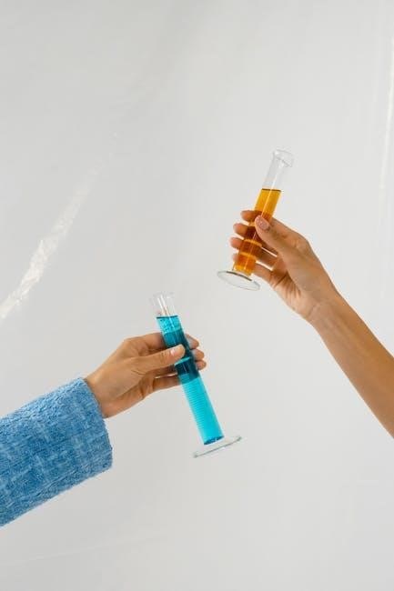
Additive color mixing involves combining light to create new colors, with red, green, and blue (RGB) as primary colors․ This method is used in digital displays, producing a wide range of vibrant hues by increasing light intensity․ In contrast, subtractive color mixing uses pigments, such as cyan, magenta, and yellow (CMY), which absorb certain wavelengths of light․ When combined, these pigments create darker, richer colors by reducing light reflection․ Understanding these principles is crucial for effective color reproduction in both digital and printed media, as they fundamentally alter how colors appear and interact in different mediums․
The 60-30-10 Color Rule for Harmonious Designs
The 60-30-10 color rule is a timeless principle for creating balanced and visually appealing designs․ It suggests that 60% of the design should dominate with a primary color, 30% should complement it with a secondary color, and the remaining 10% should be an accent color․ This ratio ensures harmony and prevents overwhelming the viewer․ Originating in interior design, this rule is widely applied in art, fashion, and graphic design․ By adhering to this guideline, creators can achieve a cohesive look, guiding the eye smoothly across the composition․ It also helps in maintaining focus and avoiding clutter, making it a versatile tool for any design project․
Practical Applications of the Color Wheel
The color wheel is a vital tool for mixing colors, creating harmonious palettes, and understanding color relationships․ It aids artists, designers, and decorators in selecting complementary and analogous colors effectively, ensuring balance and visual appeal in their work․ By using the color wheel, professionals can predict how colors will interact and create desired moods or atmospheres․ Its practicality extends to interior design, fashion, and branding, making it an indispensable resource for anyone working with color․ This guide simplifies the process of achieving professional-grade color combinations, whether for art, design, or everyday projects․
How to Mix Colors Using the Color Wheel
Using the color wheel, you can mix colors by identifying their positions and relationships․ Start with primary colors: red, yellow, and blue․ To create secondary colors, mix two primaries: blue + yellow = green, red + blue = purple, and red + yellow = orange․ For tertiary colors, mix a primary with a secondary, like blue + green = teal․ To achieve complementary colors, mix colors opposite each other on the wheel, such as red + green = brown․ Adjust hues by adding white (tint), black (shade), or gray (tone)․ This method ensures precise and harmonious color mixing for various artistic and design projects․
Creating Color Palettes with the Color Wheel
Creating color palettes with the color wheel involves selecting harmonious color combinations․ Start by choosing a base color, then explore complementary, analogous, or triadic options․ Complementary colors, like blue and orange, create contrast․ Analogous colors, such as blue, teal, and green, offer smooth transitions․ Triadic palettes, like red, yellow, and blue, provide vibrant contrasts․ Use the 60-30-10 rule: 60% dominant color, 30% secondary, and 10% accent․ Experiment with warm and cool tones to evoke specific moods․ This structured approach ensures visually appealing and cohesive designs, ideal for art, fashion, or interior projects․

Advanced Color Mixing Techniques
Explore complementary, analogous, and triadic color schemes for vibrant contrasts and harmonies․ Use the color wheel to create balanced designs, leveraging warm and cool tones for emotional impact․
Understanding Complementary Colors
Complementary colors are pairs located directly opposite each other on the color wheel, such as red and green or blue and orange․ When mixed, they create neutral shades like gray or brown, reducing saturation․ This technique is used to enhance contrast and add visual interest in designs․ For example, pairing red with green makes each color appear brighter․ Complementary colors are essential for creating dynamic compositions and harmonious color schemes, balancing warm and cool tones effectively․ Understanding this relationship helps artists and designers achieve desired moods and effects in their work․ This principle is fundamental in both traditional and digital art․
Working with Analogous Colors
Analogous colors are groups of three or more colors situated next to each other on the color wheel, such as blue, green, and yellow․ These color sets create harmony and cohesion, making them ideal for designs requiring a smooth transition․ They are widely used in art, fashion, and branding to evoke specific moods, from calming to vibrant․ For example, blue, teal, and green form a soothing palette, while orange, red, and yellow create warmth․ Analogous colors are versatile, allowing for subtle variations while maintaining visual unity․ This technique enhances compositions by adding depth without clashing, making it a popular choice for artists and designers alike․

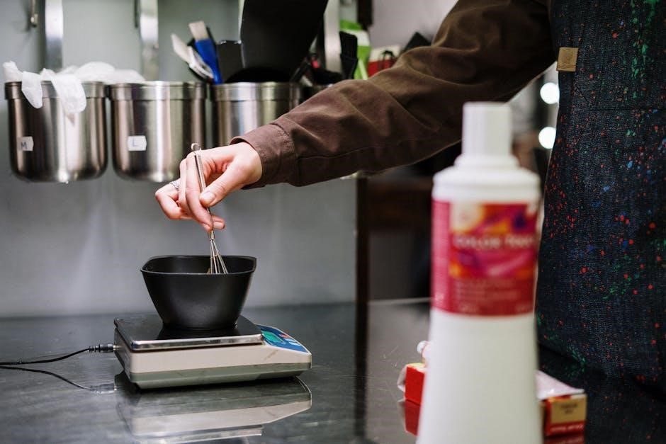
Tools for Effective Color Mixing
Physical color wheels and digital tools like Adobe Color Wheel simplify color mixing․ They provide visual aids for understanding color theory and creating harmonious palettes efficiently․
Physical Color Wheels for Artists
A physical color wheel is an essential tool for artists, providing a visual representation of color relationships․ It displays primary, secondary, and tertiary colors, aiding in understanding how hues interact and mix․ This tactile resource is particularly useful for painters and designers, offering a hands-on approach to color theory․ By arranging colors in a circular format, it simplifies the process of identifying complementary, analogous, and triadic color schemes․
Physical color wheels are widely used in art classrooms and studios․ They are portable and easy to reference, making them ideal for planning palettes or experimenting with color combinations․ Many artists rely on them as a practical guide for achieving precise color mixing and harmony in their work․
Digital Color Wheel Tools
Digital color wheel tools are modern resources that simplify color selection and mixing․ Available online or as apps, they offer interactive features to explore color relationships, create palettes, and test combinations․ These tools often include features like real-time color generation, adjustable saturation levels, and the ability to extract hex codes for digital projects․ They are particularly useful for graphic designers, web developers, and artists working in digital mediums․
Platforms like Adobe Color Wheel and online color mixers provide advanced customization options, enabling users to experiment with color harmony principles such as complementary, analogous, and triadic schemes․ Digital tools are versatile, accessible, and indispensable for today’s creative workflows, enhancing both accuracy and efficiency in color design․

Common Mistakes in Color Mixing
Overloading a color palette is a common mistake․ Using too many colors can lead to visual clutter and make designs appear chaotic․ This often results in a lack of focus and harmony․
Another mistake is ignoring color temperature․ Warm and cool colors, when not balanced, can create disharmony․ This affects the mood and overall impact of the artwork or design․
Overloading a Color Palette
Overloading a color palette is a frequent mistake that occurs when too many colors are used in a design․ This can lead to visual clutter, making the artwork or design appear chaotic and overwhelming․ A crowded palette often lacks focus and harmony, as the colors compete for attention rather than working together cohesively․ This mistake is common when artists or designers try to incorporate too many contrasting or analogous colors without a clear strategy․ To avoid this, it’s essential to stick to a limited number of core colors and use variations of those through tints, tones, and shades․ Adhering to principles like the 60-30-10 rule can help maintain balance and ensure a harmonious outcome․
Ignoring the Color Temperature
Ignoring the color temperature is a common mistake that can disrupt the balance and harmony of a design․ Colors are categorized as warm (e․g․, red, orange) or cool (e․g․, blue, green), and their temperatures significantly impact the mood of a piece․ Warm colors tend to evoke energy and warmth, while cool colors create calmness and relaxation․ Neglecting this distinction can lead to a lack of visual hierarchy and emotional inconsistency․ For example, pairing warm and cool colors without consideration can result in a clash․ To avoid this, use the color wheel to strategically select colors that align with your desired aesthetic and balance warm and cool tones effectively․
The color wheel is a cornerstone of color theory, offering a structured approach to color mixing and harmony․ Mastering it enhances artistic and design outcomes, ensuring cohesive and impactful creations․
Mastering the Color Wheel for Better Art and Design
Mastery of the color wheel elevates artistic expression and design precision․ By understanding color relationships, artists can create harmonious palettes and evoke desired emotions․ The color wheel serves as a guide for mixing colors, identifying complements, and balancing warm and cool tones․ It enhances creativity while ensuring technical accuracy․ Whether for painting, graphic design, or fashion, the color wheel is indispensable․ Practicing with physical or digital tools sharpens skills, enabling artists to explore limitless possibilities․ Ultimately, mastering the color wheel bridges the gap between inspiration and execution, transforming ideas into stunning, cohesive works of art․